








♡ update log ♡
: i made a page inspired by the old internet. I think I finally let it sink in that by staying away from certain design graphics, I was keeping my pages flat. I understand how to organize elements, but I was neglecting the true design part. I went pretty overboard on the animations though so I would definitely not recommend it if someone has sensitivity to that.
also i made an impromptu holiday card~
: ok the last few homepage templates i had did not include update logs so it's been a while since i've added something. this one will be long.
i made a new homepage lost & found page, and i'm so happy i did. looking back at prevoius homepages fills me with so much pride in how far i've come.
finally figured out cascading images (or one way i suppose with this page
made a 11/6 homepage that combined displays and used the anchor/id element for seamless navigation (if viewed on desktop. mobile was a mess for some sad reason)
made a page playing with text direction using a tvd character for inspiration because i couldn't think of anything else.
- made this new homepage combining some elements of previous homepages. i would say i very clearly wanted to recreate my 10/15 homepage in a neater way. some main differences were that i was able to fix the sidebar css; i kept the "base pages" separate from the project pages; i returned to not listing my projects by month. i'm still organizing them by month but i found that listing them by month was making me feel bad, because i know i haven't been doing as much in november. i've been burnt out and tired and also something happened that made me feel the need to step away from neocities for a little while.
oh i also made a bear blog because i didn't feel like designing my own. i'm actually really glad i did because it finally opened my eyes to the :root pseudo-element.
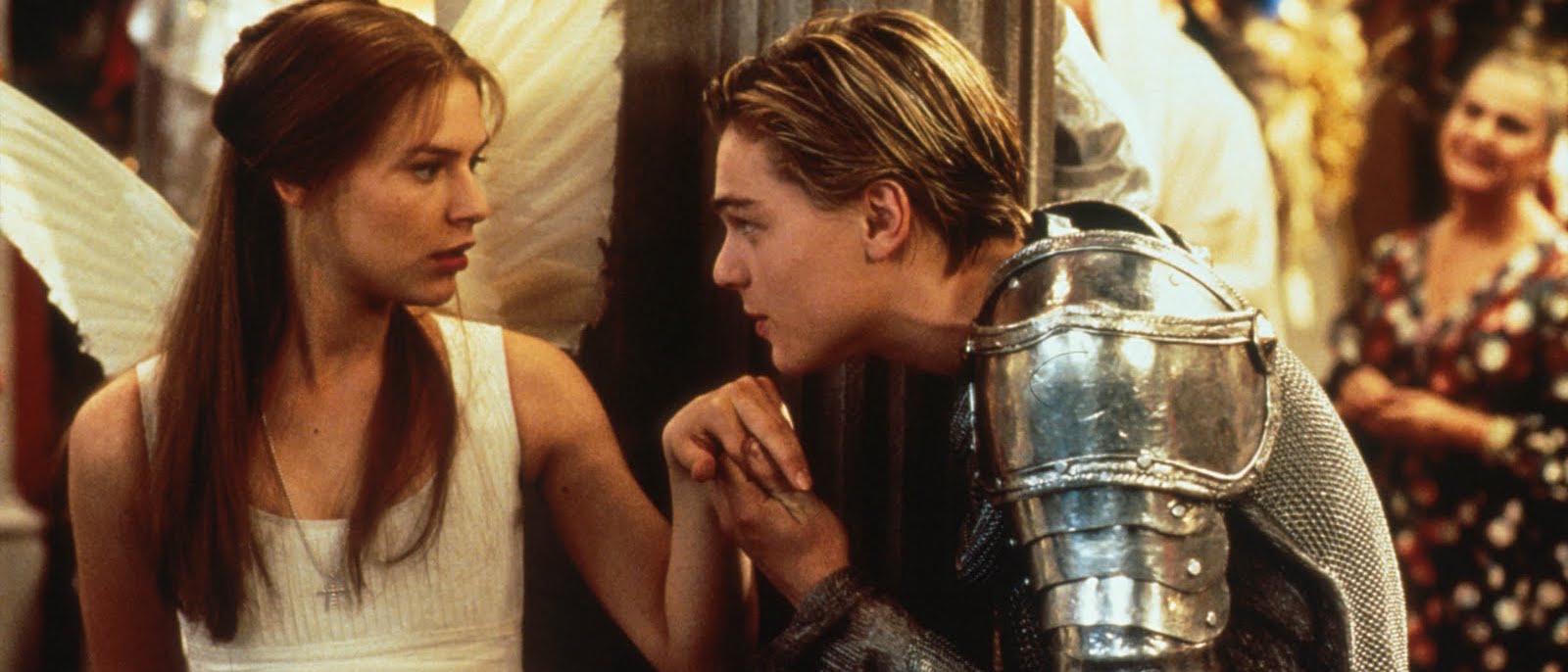
: finally fixed the xanga tribute page link on this main page. added a romeo & juliet screenplay practice page that i'd made a while back. i like the way it looks but manually editing the formatting for the screenplay is just...not worth it lol.
: hopefully fixed the external css for the new homepage look
: new homepage after starting to learn some css flex and also just wanting a less boxy look
: made an inside joke page for my partner. if anybody who sees this happens to have gone to evo 2023 and did the "jujutsu kaisen domain expansion experience," you might appreciate this. i want to put a yt video up combining the original video i used and japanese hyperpop because that's really the experience we had lol.
: made a template page for story writing where the table of contents actually works!
: made a "soliloquy" minimalist concept page. i'm probably overhyping this minimalist style page but i like it. i'm also getting to the point where i want to start adding css animations. also updated the nighthawk diner page with a quote from hemingway's "the killers," which is assumed to be an inspiration for the piece.
: NEW HOMEPAGE LOOK! i was doing html/css stuff thru to the end of september but work was so busy and i was so tired that i never got around to updating anything on neocities. then last week i was traveling so i wasn't able to do anything. so i'm putting a bunch of updates today. sorry to be annoying.
: changed index/home page to one i built fully on my own instead of the layout template i'd been using from createblog. i'm honestly in love with this and the fact that it's really mine.
: took me 2 days but finally figured out nested grids and made my first "concept" page for friends. i know design-wise i need help...but i'm happy with the grid and styling so far.
: i finally sat down and focused on css grid and i finally found Kevin Powell's youtube channel. honestly, this his learning css youtube video helped me understand it so much. i might do better with someone teaching me vs just me reading everything. anyways i know it's crap but it's the first css grid i have ever made from scratch so idgaf. i'm also super tired and have a loooong week of work ahead of me
: i wanted to try something more interesting than centered div boxes with text. so i figured out how to make div boxes (idk if that's the right terminology) with right-alignment to make it look like a conversation. originally i wanted to make this corny and romantic but then i opted for just corny so pls enjoy some egg puns i found on google images
: struggled with creating a background-image file path in css for a local file all last night and this morning so eventually i gave up. i spent most of today in a slump for unrelated reasons but i made a simple dark academia quotes page for myself. i'm definitely feeling the distance between myself and some of my webdesign goals in terms of skill, but i'm trying not to get too discouraged. i know part of this is taking the time to actually learn the programming language and rules. and at least the simpler pages can still be cute & aesthetic. (also i'm realizing i really just want to make a bunch of random web pages about my interests, i don't want to write on here. honestly, dealing with html formatting isn't worth it lol)
: made my second real page (meaning i made it from scratch myself), this time including some css. i'm honestly amazed at how simple it was and now i'm really frustrated that i didn't learn html coding in middle school and high school with everyone else lol...
: finally figured out how to center the boxes on my xanga tribute page; finally created a page with a plain black background and lime green. extremely miniimalistic and reminds me of 80s movies.
: made a "diner" page with nighthawks as a background. try to turn it into a diner page or use as index/enter/landing page?
: created a page with embedded yt playlist, "tv voicemails" from sitcoms; combined index and update log into same page
: deleted writing-related pages, started an odetochildhood section and fake xanga page, got lost in the glory and second-hand embarrassment of old internet profile icons
: added more pages and a to-do list
: created blog and set up page template!